ON THE ROLL
Catering & Events
Brand Identity · Menu Design · Print & Digital
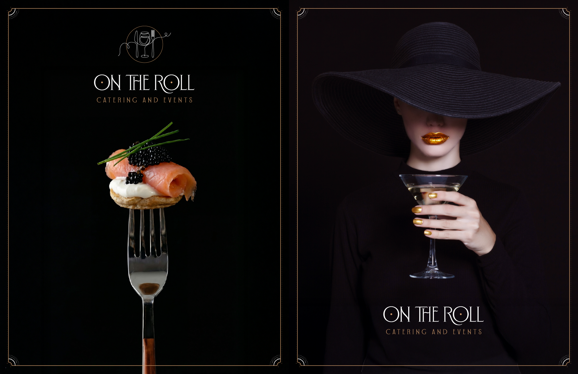
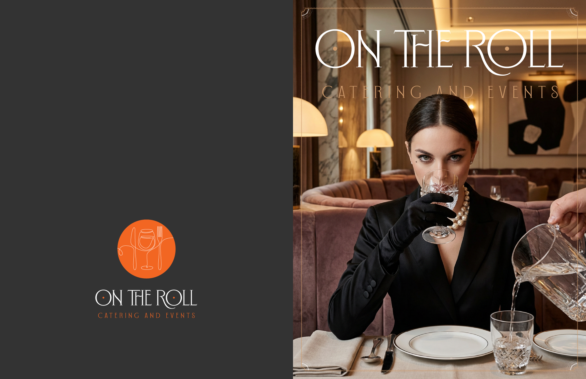
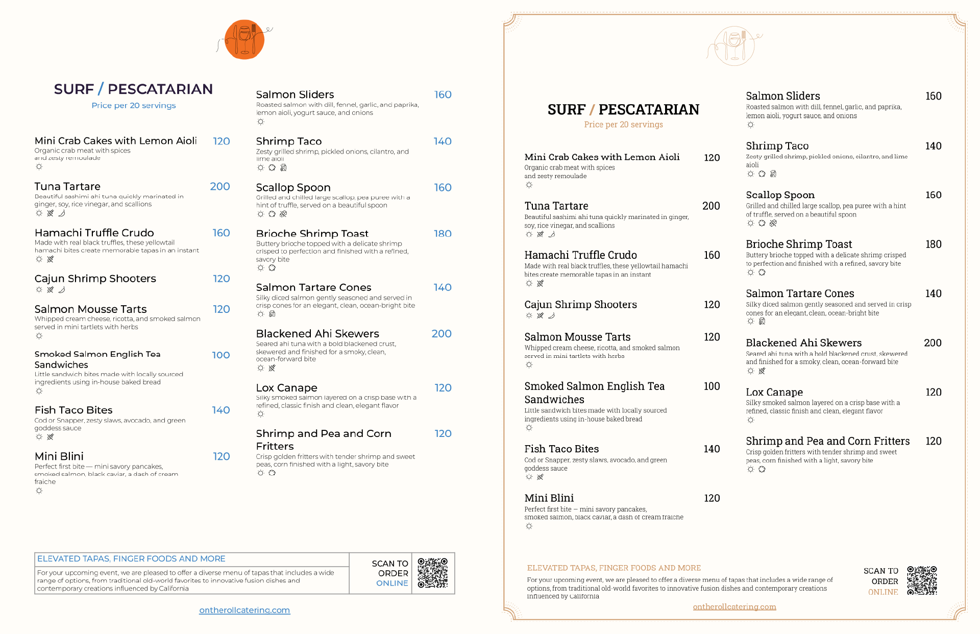
Full rebrand for a Bay Area catering and events company: logo, color and type system, a two-track menu built for different clients, and the social assets that carry it onto Instagram. The business works weddings, corporate events, and private parties - sometimes for tech clients who want something clean and modern, sometimes for guests who want a warmer, more classic table. The brand and the menu had to flex between both without reading like two different companies
Goal
Build an identity that reads as elegant and appetite-driven at the same time, then design a menu system that could serve two distinct audiences off the same content - and hand the client enough control that they wouldn't need a designer every time a price changed
Approach
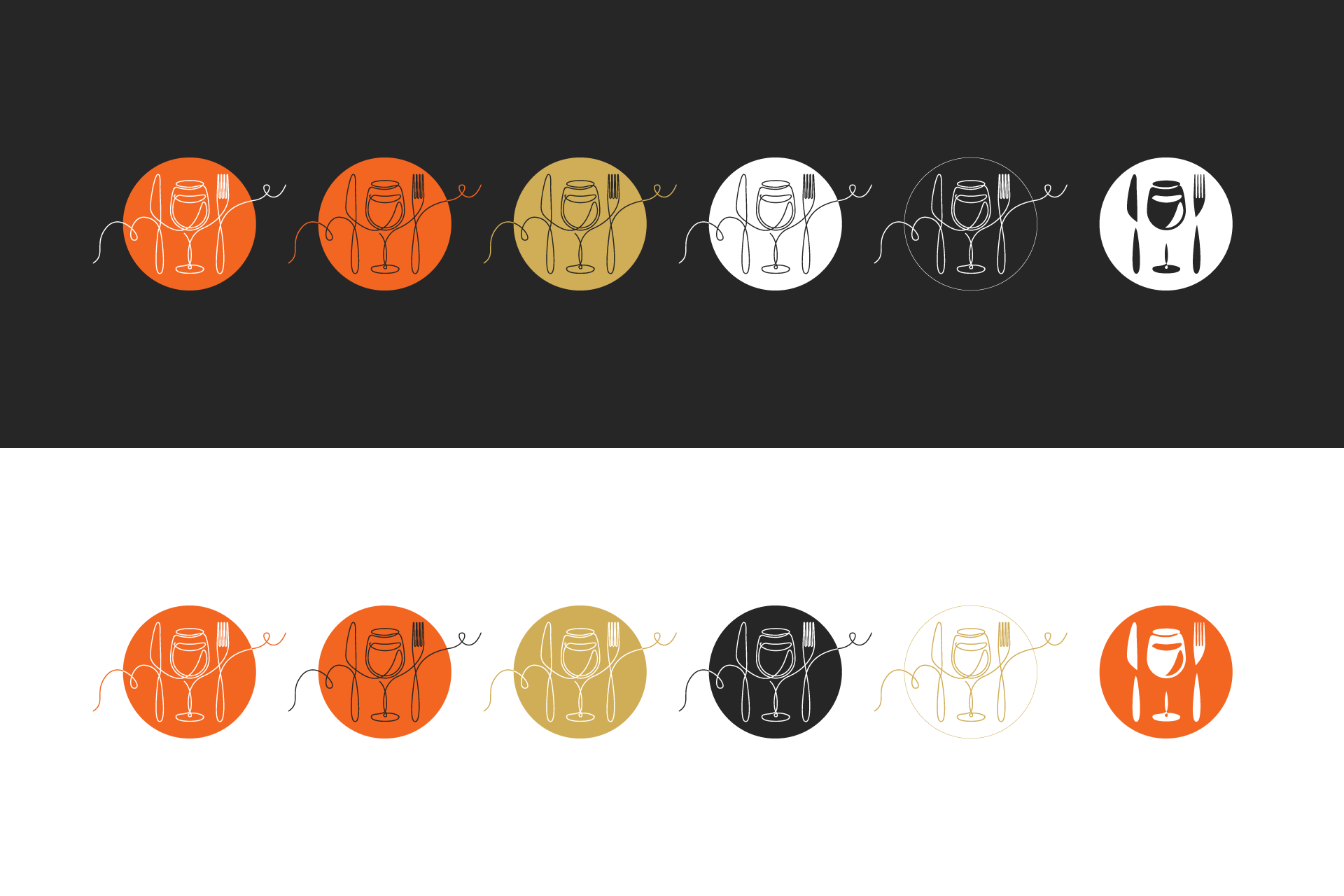
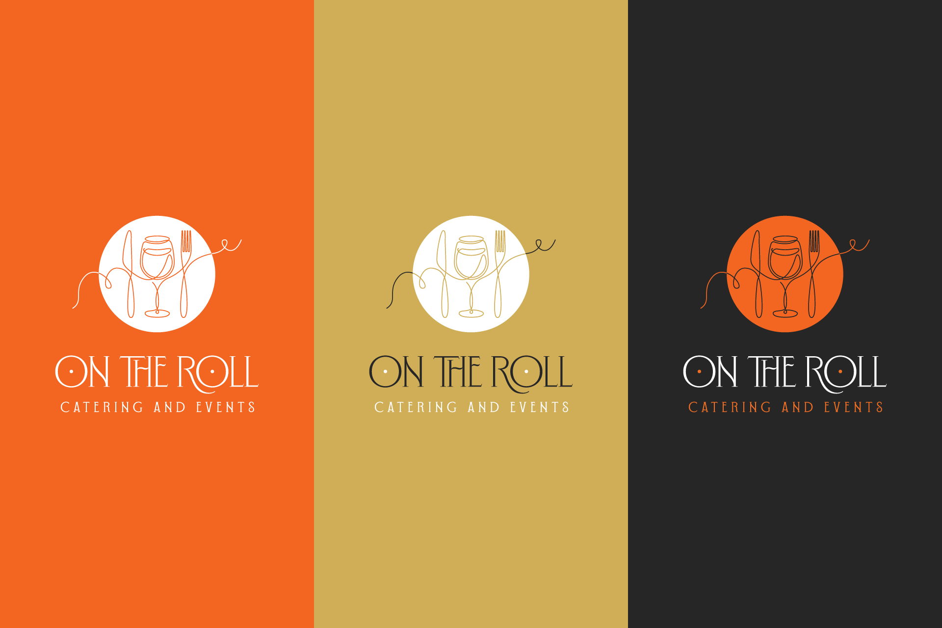
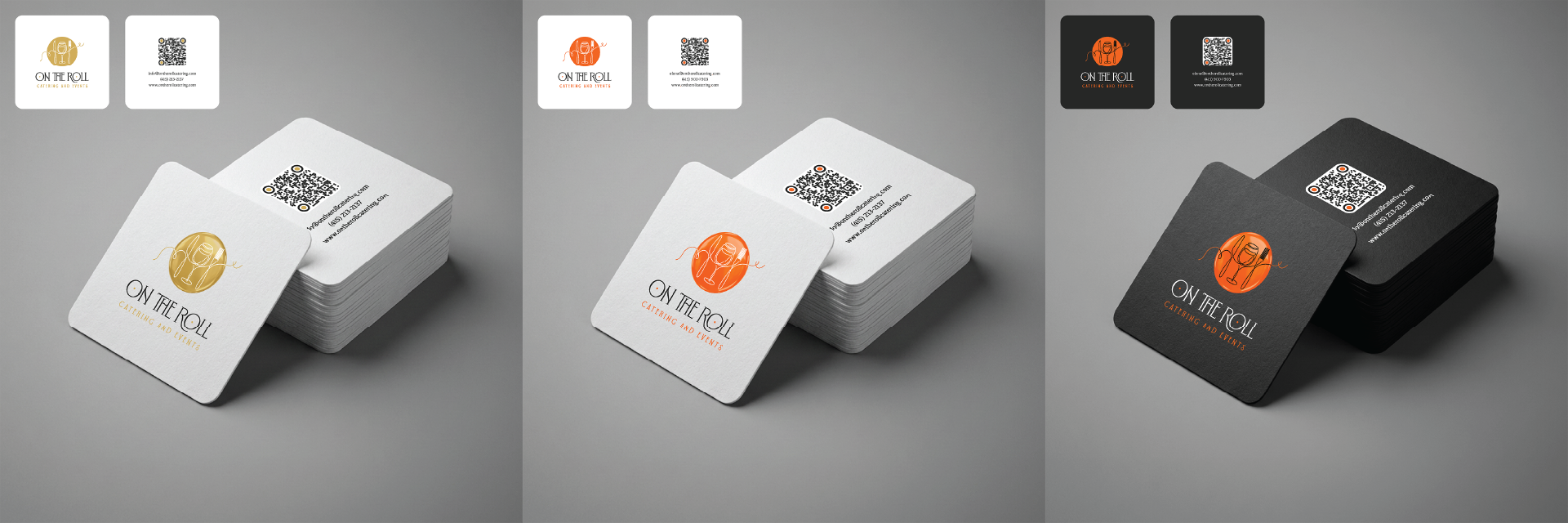
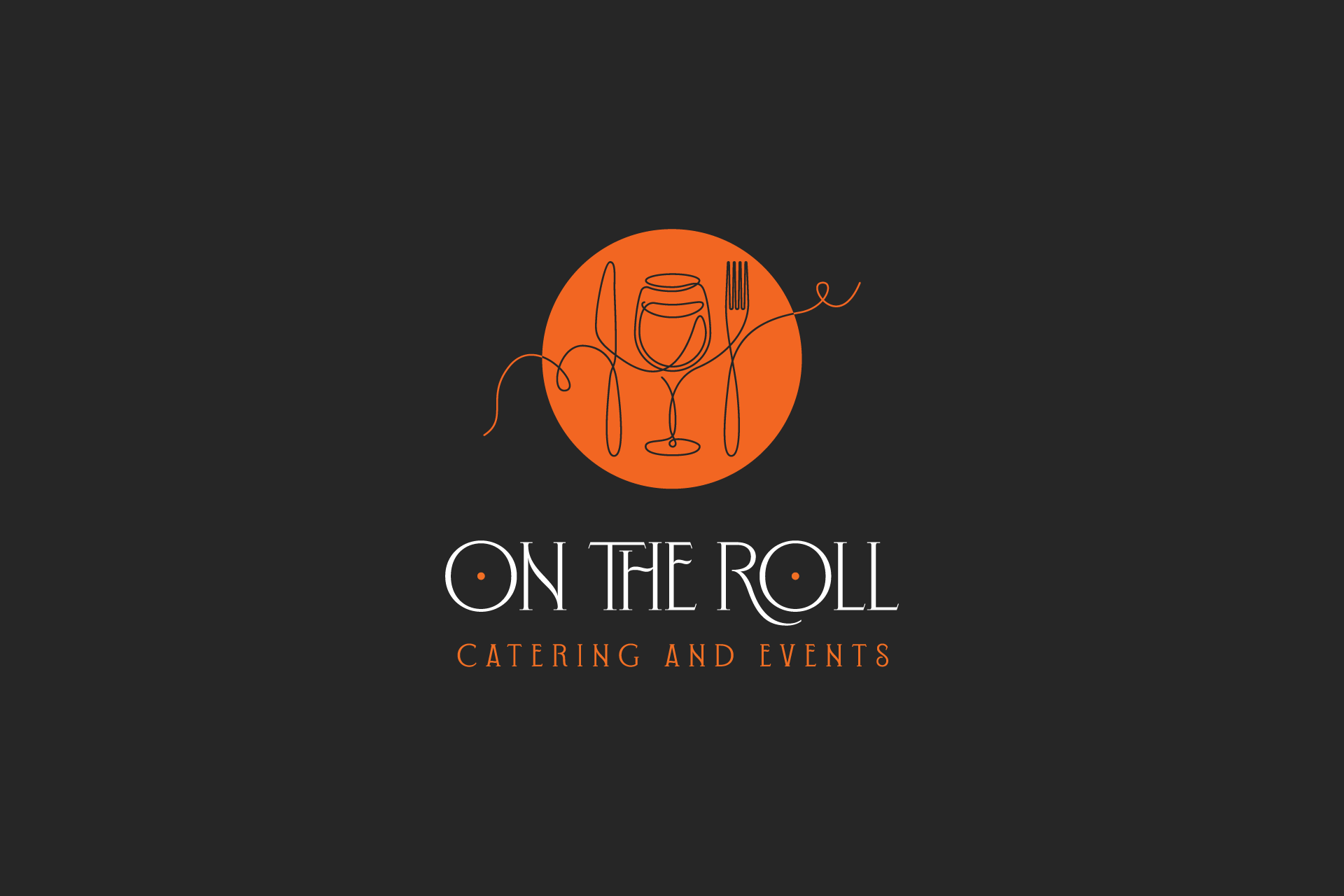
• Design of a continuous-line logo combining wine glass, knife, and fork into one mark
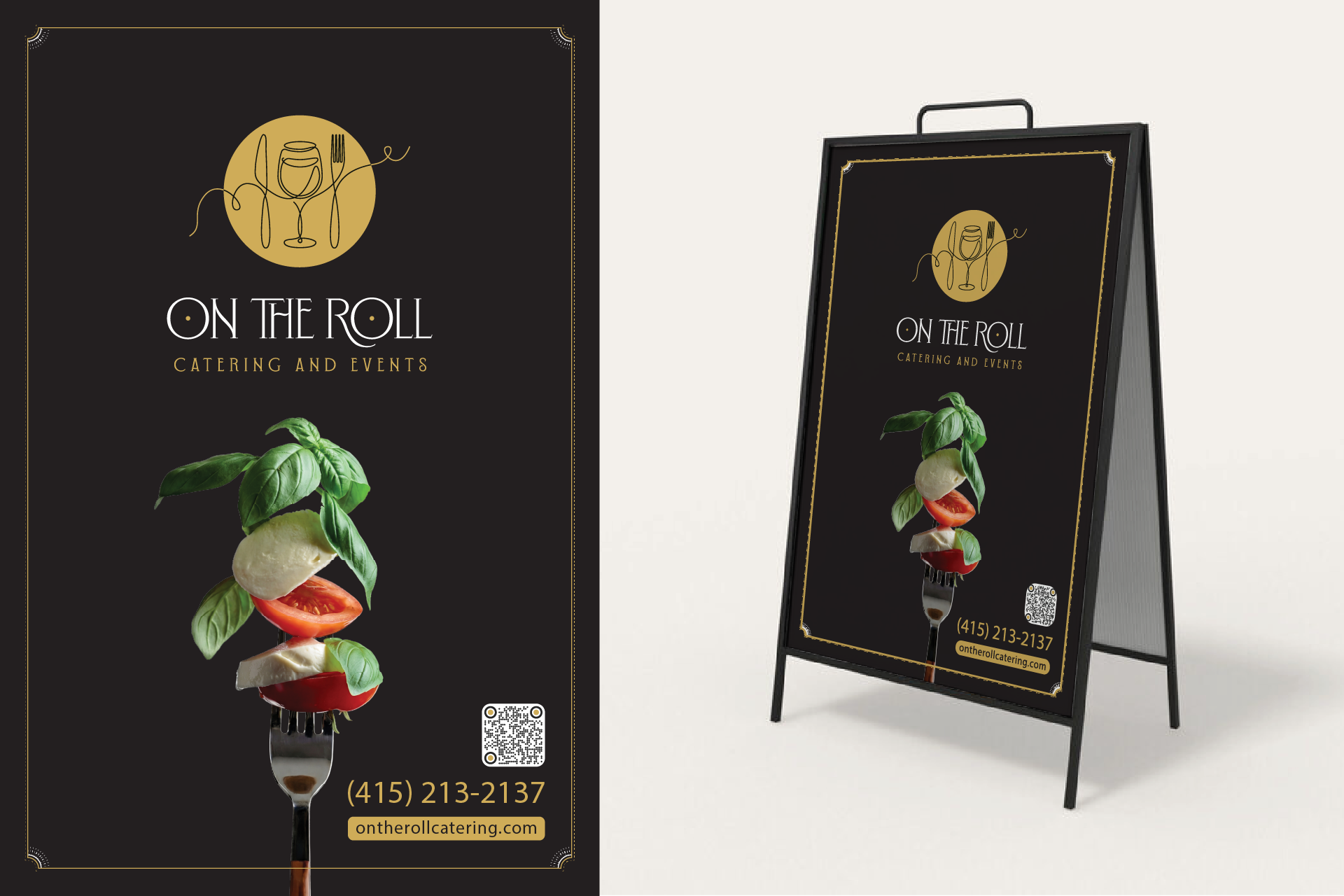
• Development of color system - orange, near-black, gold, white - for print and digital
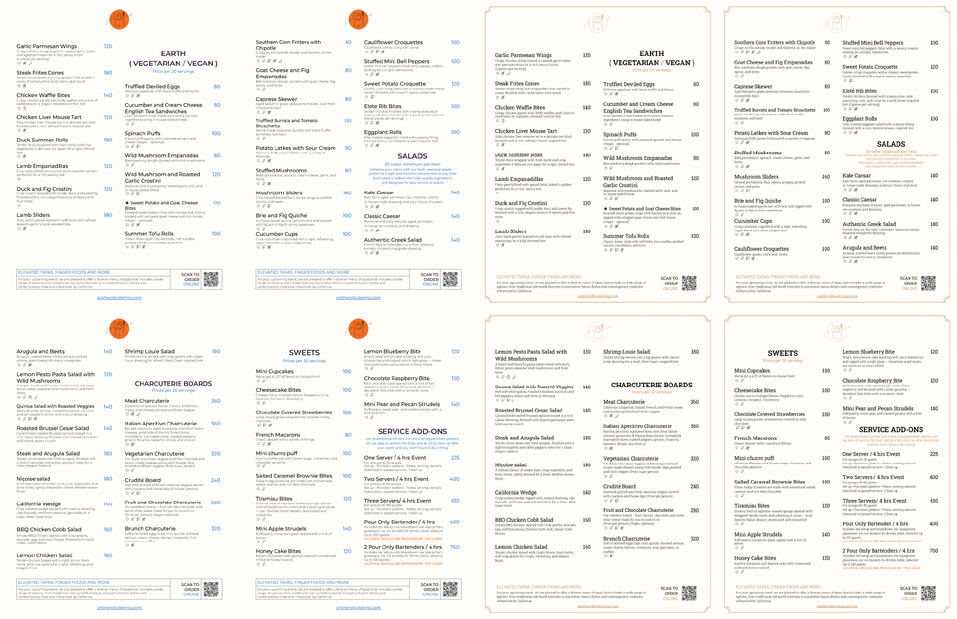
• Development of two menu editions from one structure: blue TECH and warm CLASSIC
• Integration of QR codes for print, email, and on-site scanning
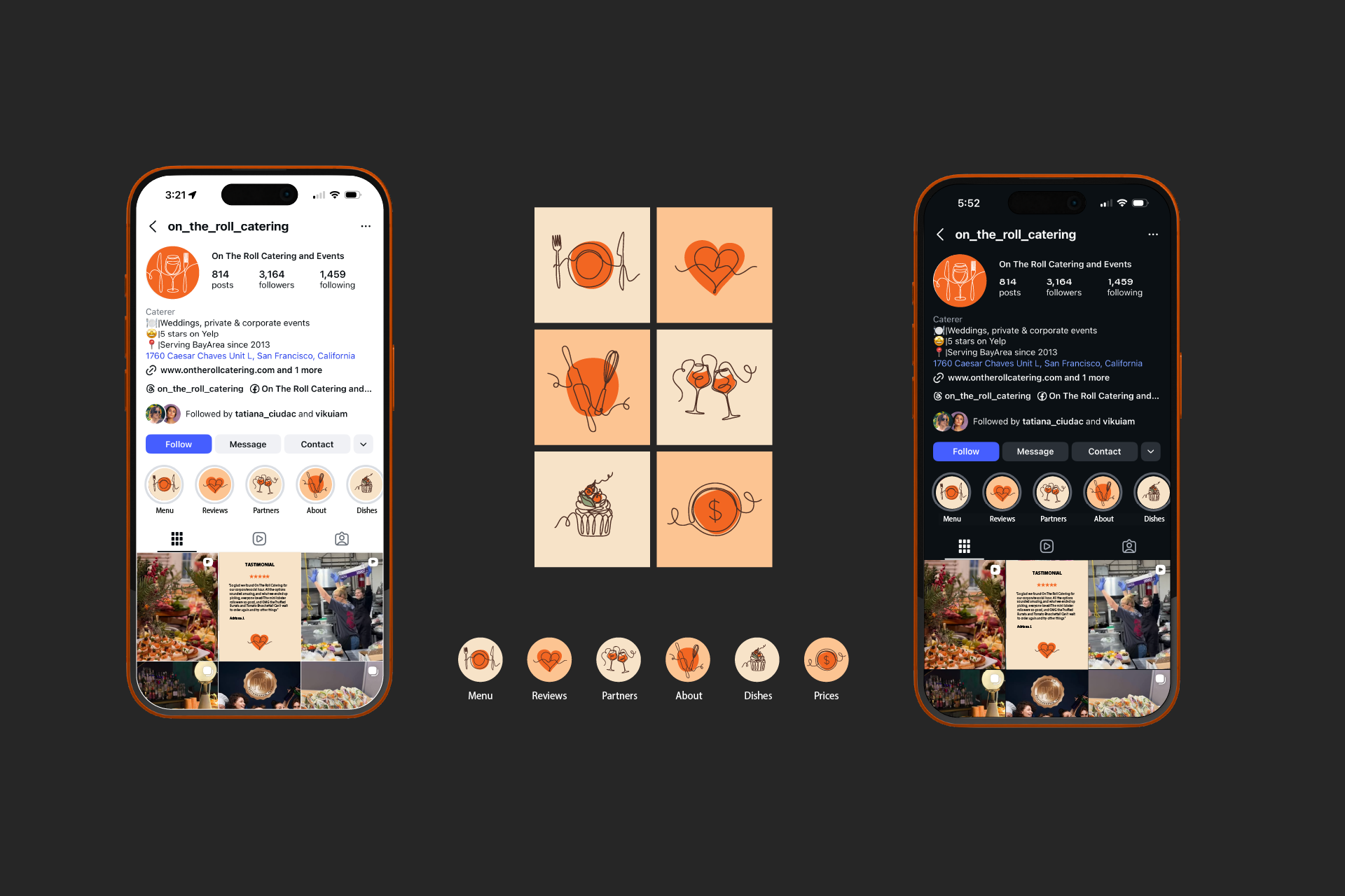
• Adaptation of menu into editable Google Docs template, plus matching Instagram assets
• Development of two menu editions from one structure: blue TECH and warm CLASSIC
• Integration of QR codes for print, email, and on-site scanning
• Adaptation of menu into editable Google Docs template, plus matching Instagram assets
Result
A caterer who runs their own brand day to day - printed menus, A-frame signage, business cards, and an Instagram presence that's grown to 3,164 followers across 814 posts, with a 5-star Yelp rating and events across the Bay Area since 2013. The client owns the menu master file and edits it directly, without depending on outside help for every small change
Role
Art Direction • Brand Identity • Menu Design • Template Engineering